Fullscreen Background Image Slideshowの使い方
- 下記ページの 「DOWNLOAD SOURCE」 よりファイル1式をダウンロード。
- ダウンロードしたファイルを任意の場所にコピー。
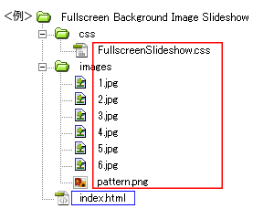
- 動作させるファイル(サンプルではindex.html)にコードを記述。
<パスは上記ファイル構成の場合なので環境にあわせて変更>
・head部分にcssファイルを読み込ませるためのコードを記述。<head> <!--ダウンロードしたファイル--> <link rel="stylesheet" type="text/css" href="css/FullscreenSlideshow.css" /> </head>
サンプルのcssコード(サンプルのcssは改変しています)
/*ページ設定部分(style.cssなどで設定していれば削除する)*/ body, div, dl, dt, dd, ul, ol, li, h1, h2, h3, h4, h5, h6, pre, form, fieldset, input, textarea, p, blockquote, th, td { margin: 0; padding: 0; } body { font-family: 'ヒラギノ角ゴ Pro W3', 'Hiragino Kaku Gothic Pro', 'メイリオ', Meiryo, 'MS Pゴシック', sans-serif; background: #000; } .container { position: relative; text-align: center; } .codrops-top { font-family: Arial, sans-serif; line-height: 24px; font-size: 11px; width: 100%; background: #000; opacity: 0.9; text-transform: uppercase; z-index: 9999 !important; position: relative; -moz-box-shadow: 1px 0px 2px #000; -webkit-box-shadow: 1px 0px 2px #000; box-shadow: 1px 0px 2px #000; } .codrops-top a { padding: 0px 10px; letter-spacing: 1px; color: #ddd; display: block; float: left; } .codrops-top a:hover { color: #fff; } .codrops-top span.right { float: right; } .codrops-top span.right a { float: none; display: inline; } p.codrops-demos { display: block; padding: 15px 0px; } p.codrops-demos a, p.codrops-demos a.current-demo, p.codrops-demos a.current-demo:hover { display: inline-block; border: 1px solid #6d0019; padding: 4px 10px 3px; font-size: 13px; line-height: 18px; margin: 2px 3px; font-weight: 800; -webkit-box-shadow: 0px 1px 1px rgba(0,0,0,0.1); -moz-box-shadow: 0px 1px 1px rgba(0,0,0,0.1); box-shadow: 0px 1px 1px rgba(0,0,0,0.1); color: #fff; -webkit-border-radius: 5px; -moz-border-radius: 5px; border-radius: 5px; background: #a90329; background: -moz-linear-gradient(top, #a90329 0%, #8f0222 44%, #6d0019 100%); background: -webkit-gradient(linear, left top, left bottom, color-stop(0%, #a90329), color-stop(44%, #8f0222), color-stop(100%, #6d0019)); background: -webkit-linear-gradient(top, #a90329 0%, #8f0222 44%, #6d0019 100%); background: -o-linear-gradient(top, #a90329 0%, #8f0222 44%, #6d0019 100%); background: -ms-linear-gradient(top, #a90329 0%, #8f0222 44%, #6d0019 100%); background: linear-gradient(top, #a90329 0%, #8f0222 44%, #6d0019 100%); } p.codrops-demos a:hover { background: #6d0019; } p.codrops-demos a:active { background: #6d0019; background: -moz-linear-gradient(top, #6d0019 0%, #8f0222 56%, #a90329 100%); background: -webkit-gradient(linear, left top, left bottom, color-stop(0%, #6d0019), color-stop(56%, #8f0222), color-stop(100%, #a90329)); background: -webkit-linear-gradient(top, #6d0019 0%, #8f0222 56%, #a90329 100%); background: -o-linear-gradient(top, #6d0019 0%, #8f0222 56%, #a90329 100%); background: -ms-linear-gradient(top, #6d0019 0%, #8f0222 56%, #a90329 100%); background: linear-gradient(top, #6d0019 0%, #8f0222 56%, #a90329 100%); -webkit-box-shadow: 0px 1px 1px rgba(255,255,255,0.9); -moz-box-shadow: 0px 1px 1px rgba(255,255,255,0.9); box-shadow: 0px 1px 1px rgba(255,255,255,0.9); } p.codrops-demos a.current-demo, p.codrops-demos a.current-demo:hover { color: #A5727D; background: #6d0019; } /*ここまでページ設定部分*/ /*ここからFullscreen Background Image Slideshowの設定*/ .cb-slideshow, .cb-slideshow:after { position: fixed; width: 100%; height: 100%; top: 0px; left: 0px; z-index: 0; } .cb-slideshow:after { content: ''; background: transparent url(../images/pattern.png) repeat top left; } .cb-slideshow li span { width: 100%; height: 100%; position: absolute; top: 0px; left: 0px; color: transparent; background-size: cover; background-position: 50% 50%; background-repeat: none; opacity: 0; z-index: 0; -webkit-backface-visibility: hidden; -webkit-animation: imageAnimation 36s linear infinite 0s; -moz-animation: imageAnimation 36s linear infinite 0s; -o-animation: imageAnimation 36s linear infinite 0s; -ms-animation: imageAnimation 36s linear infinite 0s; animation: imageAnimation 36s linear infinite 0s; } .cb-slideshow li div { z-index: 1000; position: absolute; bottom: 30px; left: 0px; width: 100%; text-align: center; opacity: 0; color: #fff; -webkit-animation: titleAnimation 36s linear infinite 0s; -moz-animation: titleAnimation 36s linear infinite 0s; -o-animation: titleAnimation 36s linear infinite 0s; -ms-animation: titleAnimation 36s linear infinite 0s; animation: titleAnimation 36s linear infinite 0s; } .cb-slideshow li div h3 { font-family: 'BebasNeueRegular', 'Arial Narrow', Arial, sans-serif; font-size: 240px; padding: 0; line-height: 200px; } .cb-slideshow li:nth-child(1) span { background-image: url(../images/1.jpg) } .cb-slideshow li:nth-child(2) span { background-image: url(../images/2.jpg); -webkit-animation-delay: 6s; -moz-animation-delay: 6s; -o-animation-delay: 6s; -ms-animation-delay: 6s; animation-delay: 6s; } .cb-slideshow li:nth-child(3) span { background-image: url(../images/3.jpg); -webkit-animation-delay: 12s; -moz-animation-delay: 12s; -o-animation-delay: 12s; -ms-animation-delay: 12s; animation-delay: 12s; } .cb-slideshow li:nth-child(4) span { background-image: url(../images/4.jpg); -webkit-animation-delay: 18s; -moz-animation-delay: 18s; -o-animation-delay: 18s; -ms-animation-delay: 18s; animation-delay: 18s; } .cb-slideshow li:nth-child(5) span { background-image: url(../images/5.jpg); -webkit-animation-delay: 24s; -moz-animation-delay: 24s; -o-animation-delay: 24s; -ms-animation-delay: 24s; animation-delay: 24s; } .cb-slideshow li:nth-child(6) span { background-image: url(../images/6.jpg); -webkit-animation-delay: 30s; -moz-animation-delay: 30s; -o-animation-delay: 30s; -ms-animation-delay: 30s; animation-delay: 30s; } .cb-slideshow li:nth-child(2) div { -webkit-animation-delay: 6s; -moz-animation-delay: 6s; -o-animation-delay: 6s; -ms-animation-delay: 6s; animation-delay: 6s; } .cb-slideshow li:nth-child(3) div { -webkit-animation-delay: 12s; -moz-animation-delay: 12s; -o-animation-delay: 12s; -ms-animation-delay: 12s; animation-delay: 12s; } .cb-slideshow li:nth-child(4) div { -webkit-animation-delay: 18s; -moz-animation-delay: 18s; -o-animation-delay: 18s; -ms-animation-delay: 18s; animation-delay: 18s; } .cb-slideshow li:nth-child(5) div { -webkit-animation-delay: 24s; -moz-animation-delay: 24s; -o-animation-delay: 24s; -ms-animation-delay: 24s; animation-delay: 24s; } .cb-slideshow li:nth-child(6) div { -webkit-animation-delay: 30s; -moz-animation-delay: 30s; -o-animation-delay: 30s; -ms-animation-delay: 30s; animation-delay: 30s; } /* Animation for the slideshow images */ @-webkit-keyframes imageAnimation { 0% { opacity: 0; -webkit-animation-timing-function: ease-in; } 8% { opacity: 1; -webkit-animation-timing-function: ease-out; } 17% { opacity: 1 } 25% { opacity: 0 } 100% { opacity: 0 } } @-moz-keyframes imageAnimation { 0% { opacity: 0; -moz-animation-timing-function: ease-in; } 8% { opacity: 1; -moz-animation-timing-function: ease-out; } 17% { opacity: 1 } 25% { opacity: 0 } 100% { opacity: 0 } } @-o-keyframes imageAnimation { 0% { opacity: 0; -o-animation-timing-function: ease-in; } 8% { opacity: 1; -o-animation-timing-function: ease-out; } 17% { opacity: 1 } 25% { opacity: 0 } 100% { opacity: 0 } } @-ms-keyframes imageAnimation { 0% { opacity: 0; -ms-animation-timing-function: ease-in; } 8% { opacity: 1; -ms-animation-timing-function: ease-out; } 17% { opacity: 1 } 25% { opacity: 0 } 100% { opacity: 0 } } @keyframes imageAnimation { 0% { opacity: 0; animation-timing-function: ease-in; } 8% { opacity: 1; animation-timing-function: ease-out; } 17% { opacity: 1 } 25% { opacity: 0 } 100% { opacity: 0 } } /* Animation for the title */ @-webkit-keyframes titleAnimation { 0% { opacity: 0 } 8% { opacity: 1 } 17% { opacity: 1 } 19% { opacity: 0 } 100% { opacity: 0 } } @-moz-keyframes titleAnimation { 0% { opacity: 0 } 8% { opacity: 1 } 17% { opacity: 1 } 19% { opacity: 0 } 100% { opacity: 0 } } @-o-keyframes titleAnimation { 0% { opacity: 0 } 8% { opacity: 1 } 17% { opacity: 1 } 19% { opacity: 0 } 100% { opacity: 0 } } @-ms-keyframes titleAnimation { 0% { opacity: 0 } 8% { opacity: 1 } 17% { opacity: 1 } 19% { opacity: 0 } 100% { opacity: 0 } } @keyframes titleAnimation { 0% { opacity: 0 } 8% { opacity: 1 } 17% { opacity: 1 } 19% { opacity: 0 } 100% { opacity: 0 } } /* Show at least something when animations not supported */ .no-cssanimations .cb-slideshow li span { opacity: 1; } @media screen and (max-width: 1140px) { .cb-slideshow li div h3 { font-size: 140px } } @media screen and (max-width: 600px) { .cb-slideshow li div h3 { font-size: 80px } }・<body></body>内にコードを記述<ul class="cb-slideshow"> <li><span>Image 01</span> <div> <h3>re·lax·a·tion</h3> </div> </li> <li><span>Image 02</span> <div> <h3>qui·e·tude</h3> </div> </li> <li><span>Image 03</span> <div> <h3>bal·ance</h3> </div> </li> <li><span>Image 04</span> <div> <h3>e·qua·nim·i·ty</h3> </div> </li> <li><span>Image 05</span> <div> <h3>com·po·sure</h3> </div> </li> <li><span>Image 06</span> <div> <h3>se·ren·i·ty</h3> </div> </li> </ul> <div class="container"> <p class="codrops-demos"> <a href="index.html" class="current-demo">Demo 1</a> <a href="index2.html">Demo 2</a> <a href="index3.html">Demo 3</a> <a href="index4.html">Demo 4</a> </p> </div>サンプルのhtmlコード
<!DOCTYPE html PUBLIC "-//W3C//DTD XHTML 1.0 Transitional//EN" "http://www.w3.org/TR/xhtml1/DTD/xhtml1-transitional.dtd"> <html xmlns="http://www.w3.org/1999/xhtml"> <head> <meta http-equiv="Content-Type" content="text/html; charset=utf-8" /> <title>Fullscreen Background Image Slideshow</title> <link rel="stylesheet" type="text/css" href="css/FullscreenSlideshow.css" /> </head> <body> <ul class="cb-slideshow"> <li><span>Image 01</span> <div> <h3>re·lax·a·tion</h3> </div> </li> <li><span>Image 02</span> <div> <h3>qui·e·tude</h3> </div> </li> <li><span>Image 03</span> <div> <h3>bal·ance</h3> </div> </li> <li><span>Image 04</span> <div> <h3>e·qua·nim·i·ty</h3> </div> </li> <li><span>Image 05</span> <div> <h3>com·po·sure</h3> </div> </li> <li><span>Image 06</span> <div> <h3>se·ren·i·ty</h3> </div> </li> </ul> <div class="container"> <p class="codrops-demos"> <a href="index.html" class="current-demo">Demo 1</a> <a href="index2.html">Demo 2</a> <a href="index3.html">Demo 3</a> <a href="index4.html">Demo 4</a> </p> </div> </body> </html> - ファイル1式をサーバーにアップロードして設置完了。